
Solution
Design Philosophy
Our approach to understanding Stefanie Posavec's design philosophy was to break down her works into their core elements and identify the thematic elements that could be used to create a unique brand identity. We identified the following key elements. The file below goes in depth about her design styles, and both Yudi and I did it. We each studied her works and presented the key elements we found in them. In summary, her designs take inspiration from her life to approach design in analytical and analog means.
Process
At first glance, Stefanie Posavec's designs seemed like art to me. However, upon deeper study, I discovered they were actually carefully crafted data points she infused with artistic flair. It was this unique combination that captured my interest in her designs. My background is in computer science, and this analytical approach to design resonated with me. I wanted to know more about Stefanie and learn from her through this project. Another intriguing aspect of this project was that I was not expected to create a design similar to Stefanie's works. Instead, I was tasked with creating a brand that was inspired by her design philosophy, to quote "Don't do it like me, do it like you 🥚". So this is not a design Stefanie would make or I would make but it is a design that interplays with both my style and her thinking (as interpreted by me)
Understanding the Artist
"For the majority of my career, my projects centred around the visualisation of a specific dataset, where the work’s aesthetic and message are created through faithfully translating every data point into graphic elements and visual form."
Stefanie Posavec, a data artist, also know as "Poetic Data Designer" because of her innovative work in visualizing data and information design. She has created wearable, danceable, or hoppable, found in hospitals, museums, or on television, and often uses a human-scaled, hand-crafted design process.
Her phenomenal works such as Dear Data, Writing Without Words, Passing Ships and Air Transformed:Better with Data Society give a deep insight into her deisgn thinking which involves turning words into visual data points using her past experiences. Interestingly, a lot of her works are analog and hand-drawn which is a stark contrast to the digital world we live in. Another interesting aspect is use of simple shapes and vivid colors to represent complex data points. This is what makes her works unique and stand out from the rest.
Design Thinking
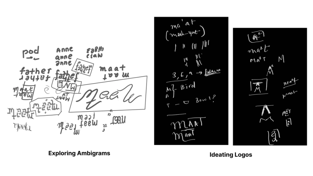
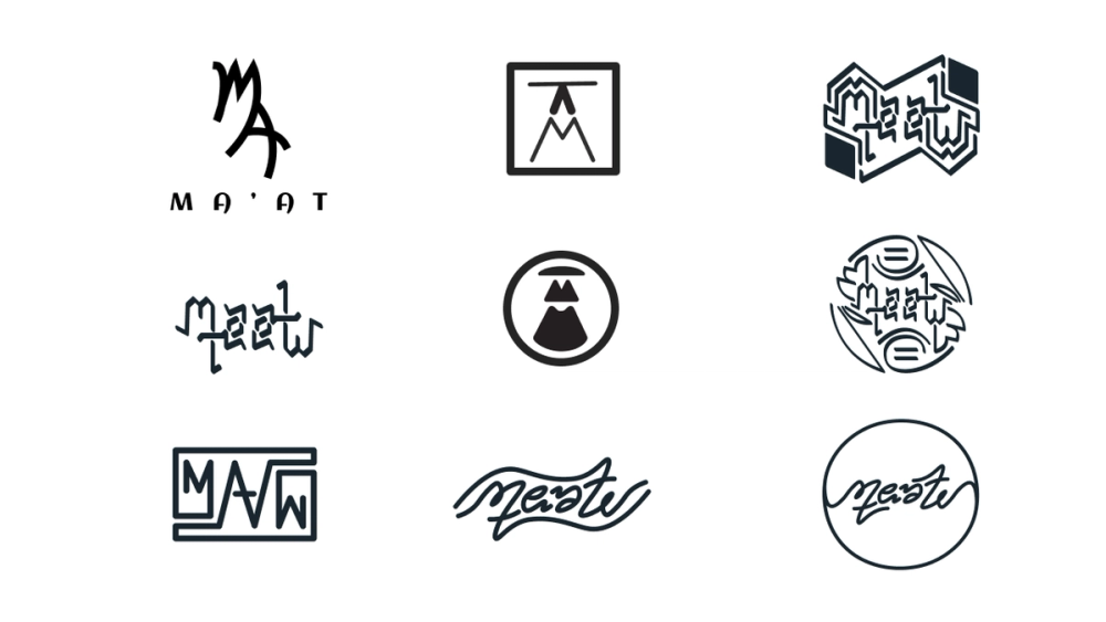
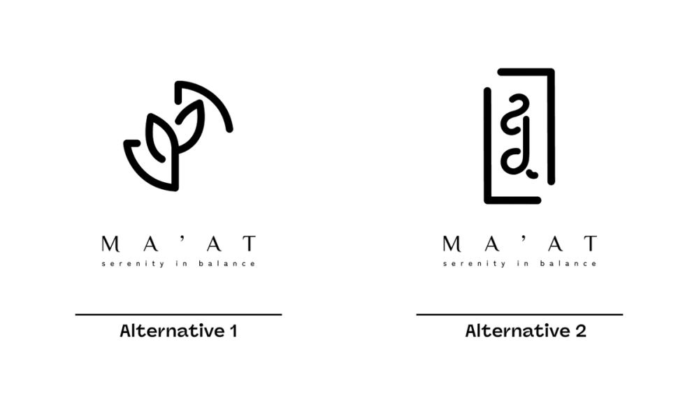
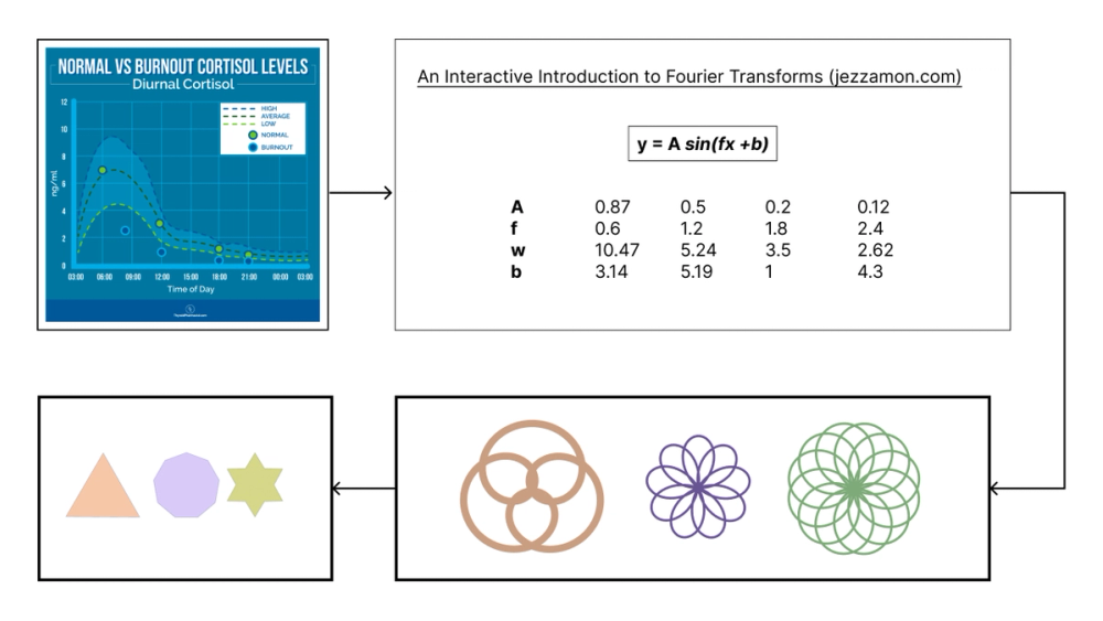
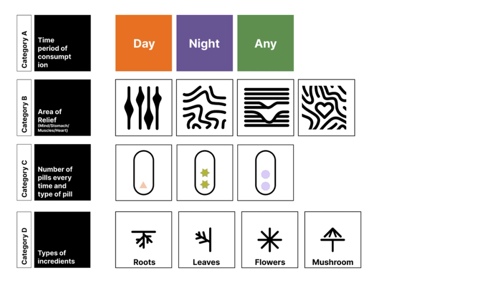
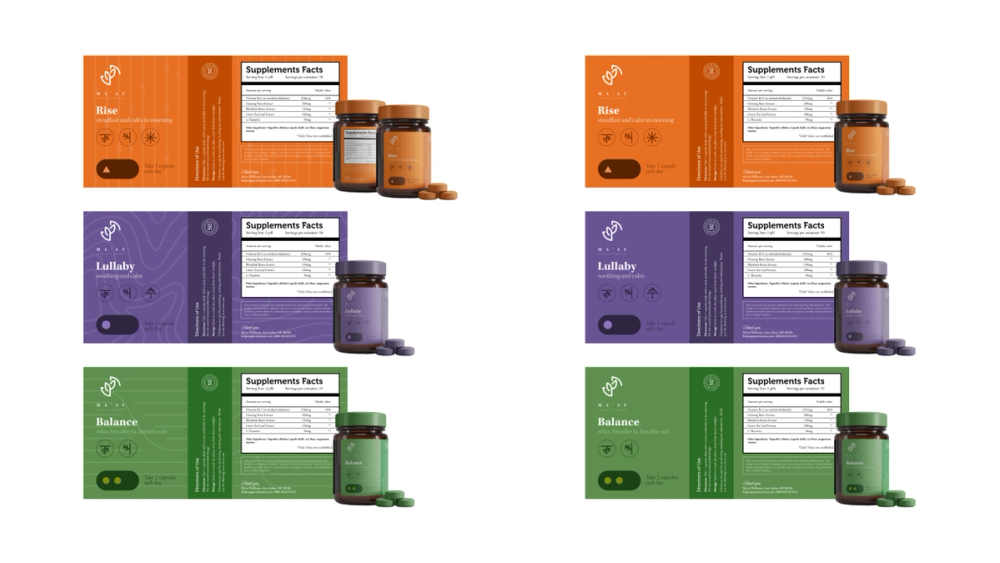
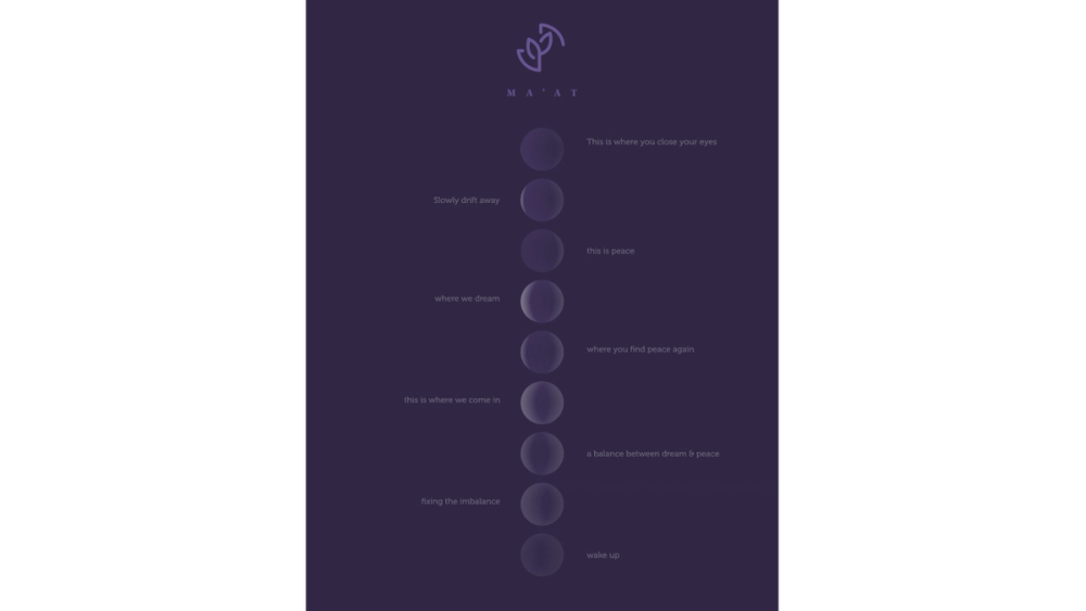
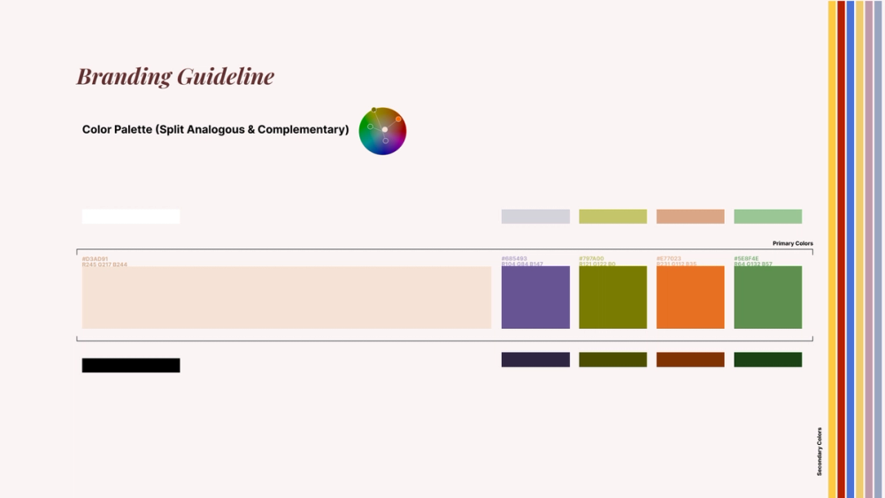
Designing Ma'at's brand identity was an exercise in balance, inspired by symmetry and natural elements. Without prior client work in logo or web design to reference, I started with playful ambigrams and symmetry, ultimately centering on a concept where the 'A' in Ma'at became a leaf. This led to two logo options: one with a welcoming, organic feel and another embodying a modern luxury style. Building a visual identity, I used data-driven concepts around stress and sleep, leveraging Fourier Transformation to create polygons from cortisol graphs, symbolizing day, noon, and night. A cohesive color palette followed, representing day, night, and all-day products, designed to scale with future needs. I created web and mobile prototypes along with media mockups, and for a final touch, I crafted a poster combining sleep cycle data with Ma’at’s themes. Moon phases represented sleep stages, with balanced visuals reflecting good rest—capturing Ma’at’s essence of harmony and well-being.
Ideating for logo


Developing Designs
Designing Ma'at's brand identity was an exercise in balance, inspired by symmetry and natural elements. Without prior client work in logo or web design to reference, I started with playful ambigrams and symmetry, ultimately centering on a concept where the 'A' in Ma'at became a leaf. This led to two logo options: one with a welcoming, organic feel and another embodying a modern luxury style. Building a visual identity, I used data-driven concepts around stress and sleep, leveraging Fourier Transformation to create polygons from cortisol graphs, symbolizing day, noon, and night. A cohesive color palette followed, representing day, night, and all-day products, designed to scale with future needs. I created web and mobile prototypes along with media mockups, and for a final touch, I crafted a poster combining sleep cycle data with Ma’at’s themes. Moon phases represented sleep stages, with balanced visuals reflecting good rest—capturing Ma’at’s essence of harmony and well-being.
Final Designs


Reflection
What went well?
I learned A LOT, like really A LOT. From design thinking and ideating to data visualizations in a non-traditional way, incorporating GPT to make complete concepts and filler content form a coherent brand. I chose Stephanie Posavec to learn about her design thinking; I am confident I have benefited from such an analytical approach to creativity, which I can use in future projects.
I have improved my workflow on how to draft faster and create practical prototypes using ChatGPT because while I could have thought of these, GPT helps speed this up and allows for faster prototyping.
Another thing I have learned during the project and course was design documentation and how it is necessary to document each product.
What could be improved?
The project could have significantly benefited from ideation, as conflicting time schedules made it hard to collaborate synchronously and ideate. We ended up working asynchronously and division of work, which allowed this project to grow, but we could have done more if we had more time to ideate together.
What possibilities emerge?
While this was a one-off project, I see the concepts I have learned in this to assist me in working as a designer. I can use design thinking to create more coherent and unique designs. I can use data visualization techniques to create more engaging and informative designs. I can use the GPT to develop more complete concepts!
I am looking forward to using these techniques in future projects.