
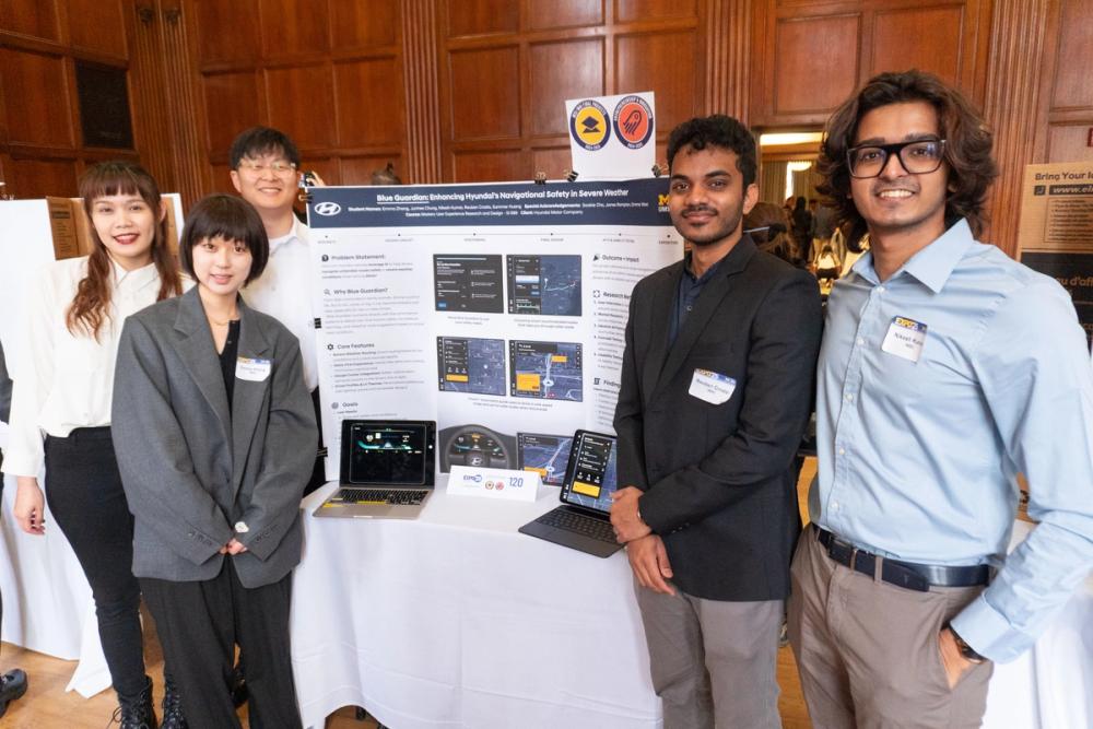
As a part of UMSI's capstone project, SI 699, I worked in a team of 5 alongside Sookyung Cho (Sookie, UX Researcher at HATCHI CA) to devise accessible solutions leveraging AI to assist drivers with their pain points. Hyundai is looking for ways to improve accessibility in cars by incorporating AI. Followingly, my team developed a WCAG-compliant accessible solution called Blue Guardian – a copilot for severe weather that uses intelligence for better route guidance using crowdsourced data and makes voice more customizable.
Research
From daily commutes to family errands, driving is part of life. But in rain, snow, or fog, it can become stressful and risky, especially for new or older drivers. We conducted a market study to understand problems faced while driving by
- interviewing 9 frequent drivers in the USA of the age group spanning from 18-60+ in Michigan with an average experience of driving about 17 years (median: 8 years)
- surveying 55+ people, where 79% of respondents feel most unsafe when driving in extreme weather conditions
- conducting a stakeholder interview to understand the client's expectations and needs
Ideation
Based on our research findings, we conducted a Crazy 8s ideation round to assimilate different findings from each stage into concepts and came up with 30+ ideas that were synthesized into 3 concepts. 3 concepts were further refined and narrowed to a single concept: Blue Guardian Navigation System, with core features being:
- Smart routing to prioritize & minimize severe weather before driving
- Multimodal real-time alert and alternate route suggestion while driving
- AI-driven by crowdsourced data and real-time weather reports from credible sources
- An interface that is accessible
Design Evolution
Wireframes
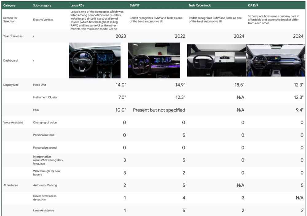
Before developing low-fidelity, our team split off to understand the sitemap, current features in the IVI of the competitors recognized by Hyundai, as well as those with leading technological developments, such as BMW and Tesla, with Kia EV9 as a baseline for comparison. We split the team into 3 groups – 1 responsible for project management, 2 for research, and 2 for design, with me being the latter (design).
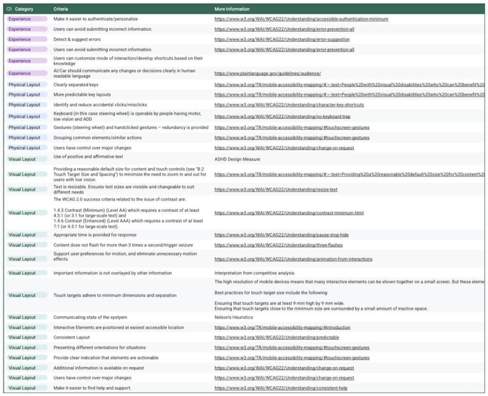
My team developed variations of low-fi to understand the amount of information users preferred, the accessible areas, and visual preferences for changes in route. We also developed a moodboard to develop a rough idea of future visuals. These variations were used for concept testing to discover 3 main findings: visual, voice, and information preferences. I also developed accessibility heuristics to keep in mind for future developments
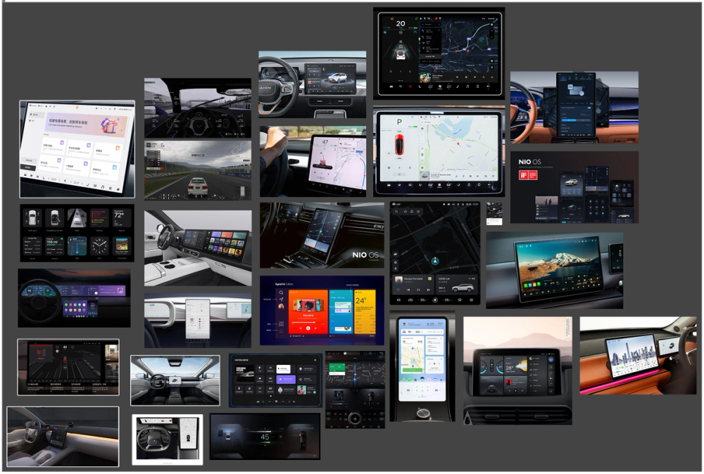
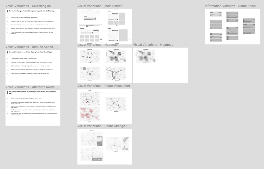
Moodboard for designing the IVI and IC


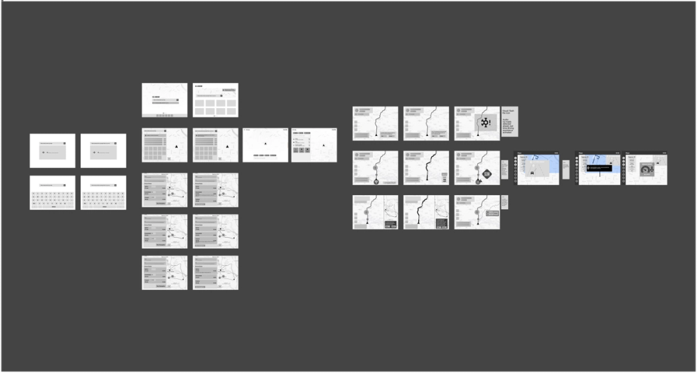
Medium-fidelity Design
Our findings from the 4 concept tests revealed that people liked the idea of real-time navigational aid during bad weather, but also indicated strong reliance on personal intuition, especially among the older age group. We were able to determine design directions for:
- Information density of the routes
- Improve system feedback
- Reposition and prioritize alerts based on where drivers naturally look
- Voice & tone of AI
- Reduced usage of the term "AI", as it leads to doubt
This indicated a need for more convincing visuals and information for route recommendations, as to why a user should take a longer route that is safer over a route that is faster.
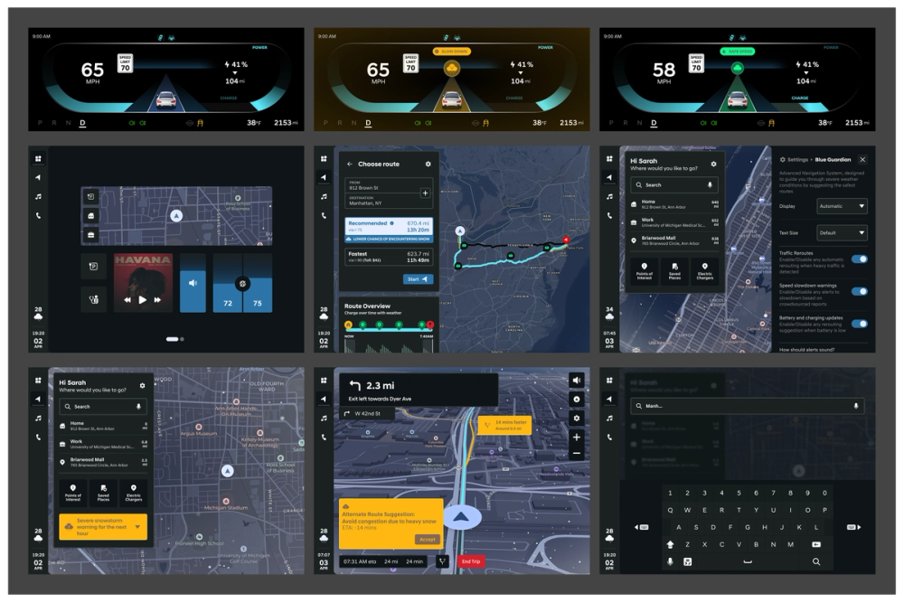
High-fidelity Design
After conducting 5 usability tests (averaging a SUS score of 95) with our mid-fi and a stakeholder interview, I developed a design system consisting of colors, typography, safe areas, grid, icon-sizing, and components. A few of the design changes are as follows:
- Reselected crucial icons to enhance intuitiveness (Normal weather icons → weather icons with smiley/sad faces to indicate safety)
- Revisited & shortened the audio script and pop-up text to reduce information overload
- Added short description under safety-related settings to clarify functionality
- Highlighted warning color of the instrument cluster to enhance severity & catch users’ attention
- Added onboarding to allow personalization for different age-group users
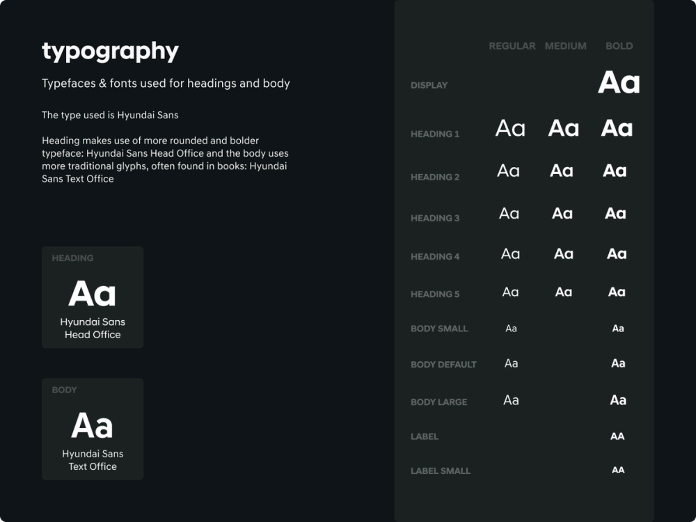
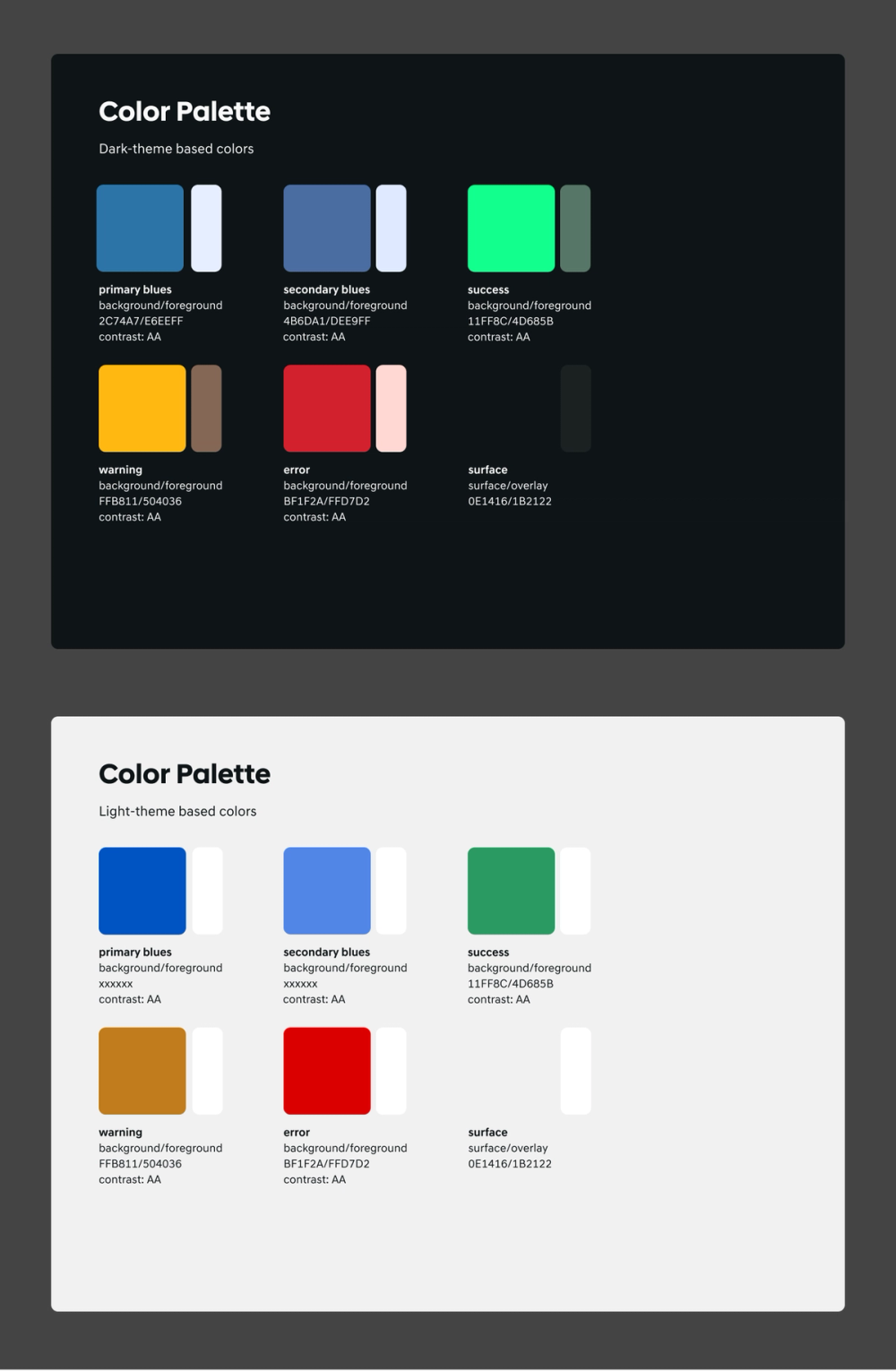
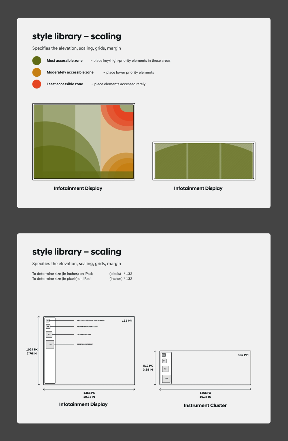
Design System


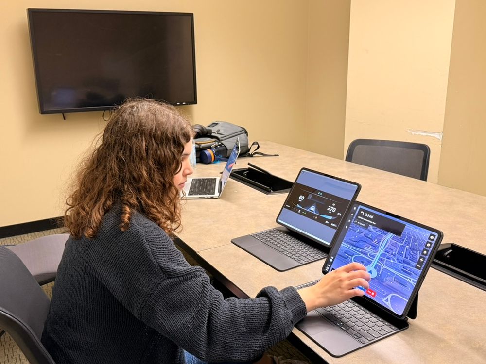
Prototype
Link to our Design System & Hi-Fi
Accessibility Concerns
Results
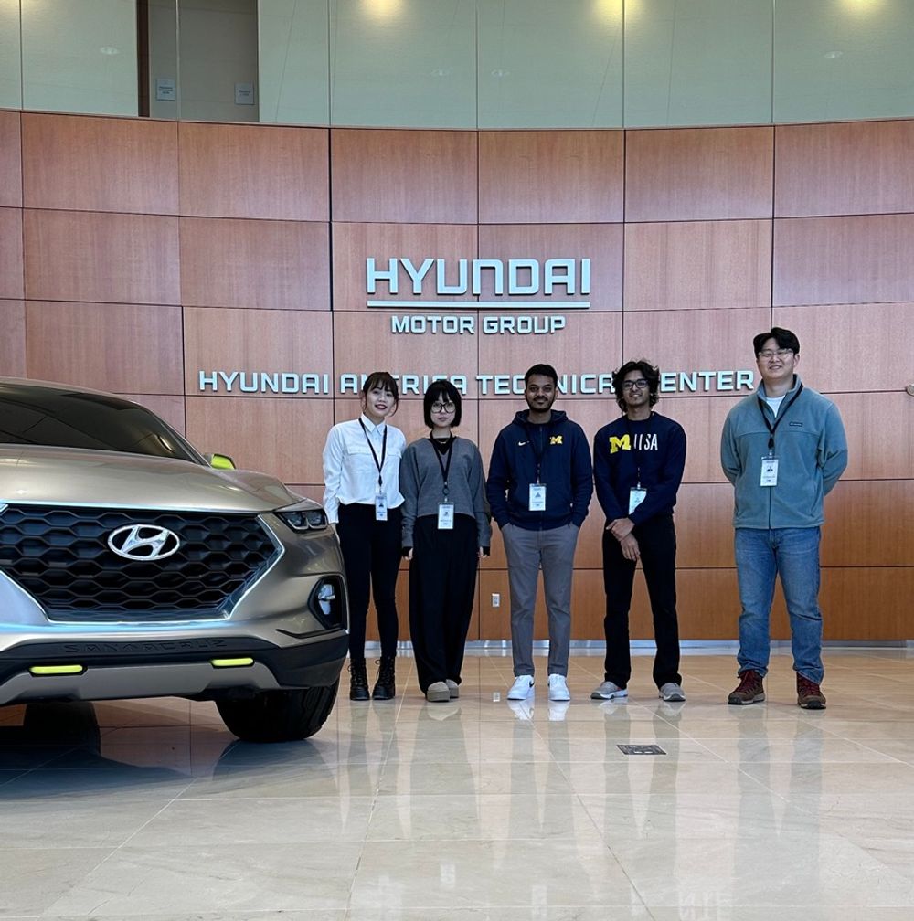
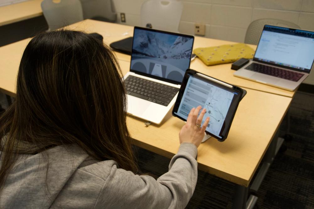
We presented this to the HATCHI team located in Irvine, CA, USA, over a Zoom call, and also presented it at the UMSI Exposition
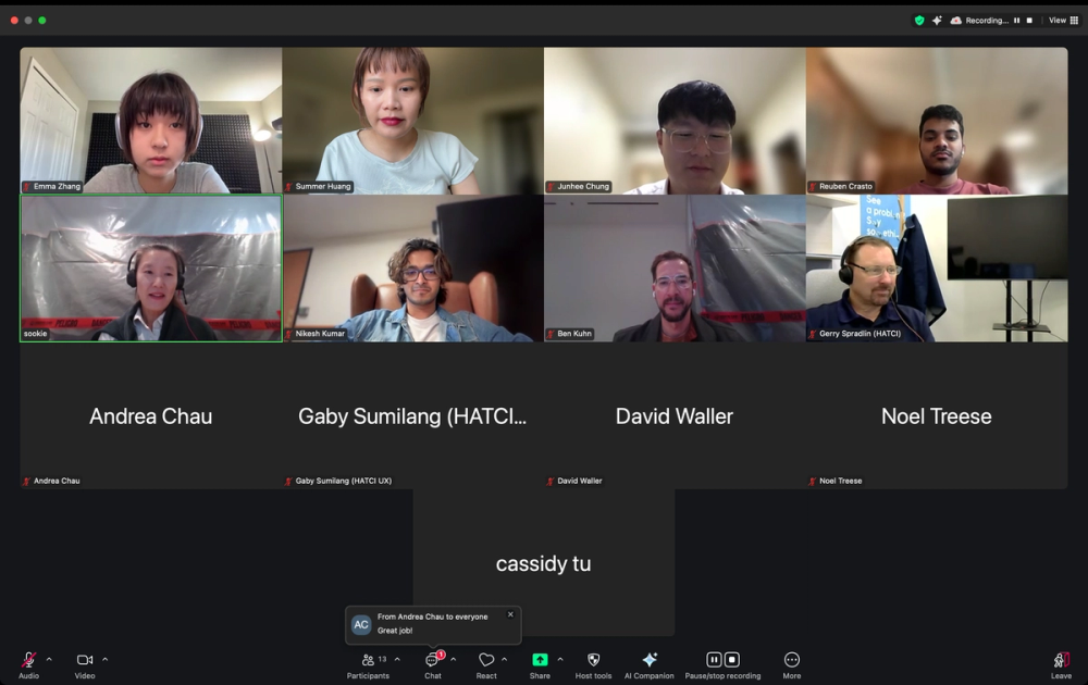
Zoom meeting presenting the research and design for Blue Guardian


Reflection
What went well?
I consider that a lot of things went well, considering we pulled through many setbacks. One of the biggest learning opportunities for me was the importance of division of labour when it's a big group putting in 40+ hours/week, and everyone has a different design preference. Furthermore, the value of prioritizing research over deliverables proved crucial, enabling strategic project redirection and shaping its ultimate success. Lastly, I experienced the importance of constructive feedback and informal team interactions, which help develop better interpersonal relationships and encourage open communication of ideas and opinions.
What could be improved?
Being a capstone class, we were conflicted between class expectations and client expectations. I believe we could have benefited from setting our own milestones for this project
What possibilities emerge?
One of the most important areas I explored in this project was accessibility concerns in a professional setup, studying users' behaviours in usability testing, unlike any done before, as it involved developing for physical devices that are prone to time-sensitive use.